Donnerstag, 26. Februar 2015

GIFS GIFS GIFS


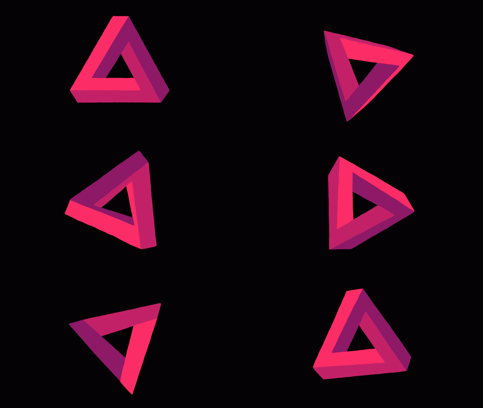
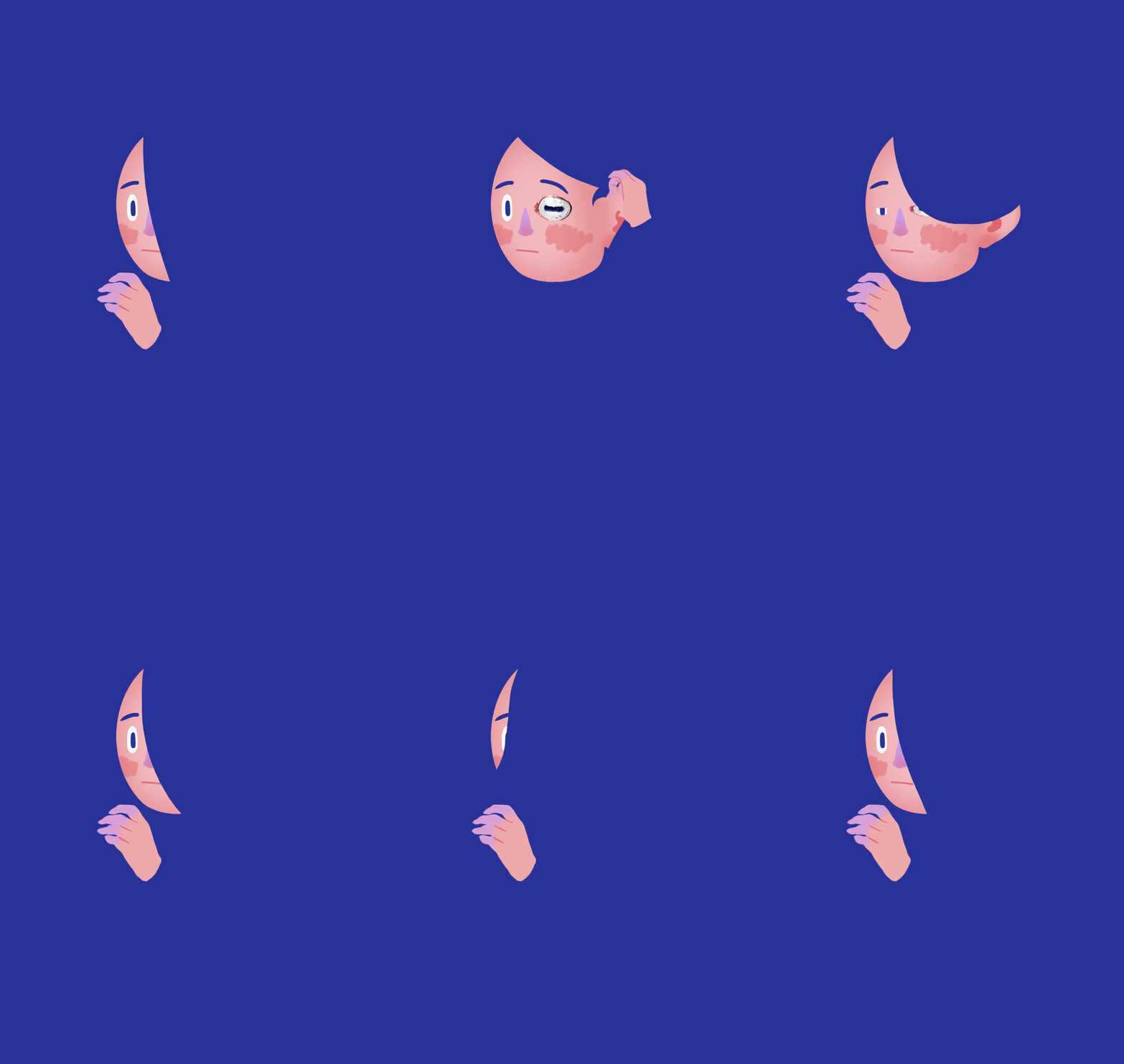
I'd like to present to you some of my final gifs. The gifs are basically snippets from the animation. I drew them in Photoshop and then saved all the individual frames as JPGs that I have used to make a proper film using After Effects. I liked looking at the gifs during the making of the film as it motivated me to see the results of my labour, though.


Some of the gifs aren't really from the final thing since I forgot to continue making them at some point. My laptop really struggles with the larger files, especially with the penrose triangle. It all but decided to do everything in slow motion when the clouds came into the picture. To be honest, I felt like crying at more than one point.

Sketchbook/Journal Scans

At first I had thought about making a game, a tarot game that could be played online and offline. These scans show some of my research and thought processes of the tarot idea that I did not follow through in the end:


My first sketchbook was, when it was full, pretty unorganised. Or, to be honest, not organised at all. That is why I choose to upload the relevant pictures and research onto my blog as scans. This way I can curate way better.

I also wrote down and drew a few of my ideas for the animation. They are way better depicted in my final Storyboah-Journal, but some of the ideas I didn't use.


I also educated myself about formal Storylines. That was interesting, but I had a pretty good idea how I wanted to present the story relatively fast and ended up not using these templates. I also wrote down a few names I had found in the "Animation Bible" in the NUA Library, I believe. Some were pretty hard to find but others I liked a lot!


Before I had settled on the idea of an animation I had actually thought about combining animation and gamedesign into one package. I was, however, too heavily influenced by the game "Monument Valley", as I then realised. It made me biased and restricted in my design choices and that is why I decided not to do it.


Donnerstag, 5. Februar 2015

Part Two: Emotion


So, I started animating 'Part Two - Emotion' today. I haven't said this on this blog yet, but the short film is basically devided in 4 parts and two themes. The themes are 'OUTSIDE' and 'INSIDE', which means - simply enough - that the action is either taking place inside or outside my body. The 'INSIDE' parts are enveloped by the 'OUTSIDE' parts, which I find is both fitting and feeling more natural than any other option.

The parts:

ONE - introduction (outside)
TWO - emotion (inside)
THREE - logic/thought (inside)
FOUR - goodbye (outside)

This will probably be more conclusive once the animation is actually done.

Anyways, in part two I introduce/show the people I love (among other things). I have been sitting at my laptop almost nonstop since 9:30 am today and have only gotten around to two of the eight people I want to show - and one of them is a dog. Animation is a long process and I get constantly distracted by how awesome something looks once it's actually working.

I made several GIFs to document this:


The heart transforms into the stilised face of my brother Leonard. It's still pretty rough.


Once I added the veins it looked a bit smoother, but it's still not finished.


This is finally the finished transformation – 26 frames.
Next I animated the easiest face of the bunch; the one of my dog, Lella.


And finally I tried out how it would look like when the faces keep coming, as I wanted to have the heart beating inbetween.


Montag, 2. Februar 2015

Hello


I figure I worried too much. As I decided to only go with 15 fps it will be much easier to fill up the 1-2 minutes that I have set as an approximate timespane for the short. On top you can see the startsequence introducing the title of the short; 'Hello'. Nice and simple, I suppose. I like it well enough, though the color might need a bit improving, it looks muted. But that I can leave for another time. As of now I'm concentrating on getting this animation finished as soon and cleanly as possible.

On Charles Huettners website I've found a very informative how-to video regarding Photoshop frame-by-frame-animation and how to work on it with AfterEffects. :) 

So helpful!

In related news, I have also found this website, which has been a good source of inspiration for me:

http://latenightworkclub.com/

Huettner is a member, apparently.
Also: Caleb Wood! His TOTEM Video is great!

http://vimeo.com/92869692

Samstag, 31. Januar 2015

This will take so much time!

Started animating the first sequence of the short. Getting kinda worried if I'm able to complete this as well as my other projects in time. We'll see.

Sneakpreview...

Mittwoch, 28. Januar 2015

Make Your Mark: Initial Inspiration

So,  I had a little trouble with this assignment. At first I came up with two seperate ideas. One was to make an animation short film in which I try to translate the weirdness and abstractness of my thought processes to the viewer, and the other one was to be a variation of a Tarot card game, which I wanted to be interactive and playable. While the people I talked to about these ideas all seemed to like the Tarot-one better, I have come to realize that I personally lean more towards the animation short film.

There is just so much going on regarding the game idea; it has to be playable, so I'd have to think up an actual strategy/algorithm and program it (though that part would supposedly not be the hardest, as I have already been told about an online platform with which it is apparently quite easy to make games without a lot of coding), but while I want to keep the player involved and thereby interested, the assignment is for me to present myself to an audience.


To combine these to vital parts of my idea seems downright impossible to me right now. Initially, I wanted to use the design of the individual Tarot cards as a medium for myself, arrange them in a random pattern und then have a Chinese-Lucky-Cookie type of thing come out at the bottom: a fake and fun future prediction for the person playing the game. I definitely think that it would be possible, only I'd need more than four weeks to actually make it work. Also, as I come from more of an illustration background, I noticed that I had concentrated mainly on the design and illustrations adorning the cards than on the actual gameplay. Once I admitted to myself that the idea is undercooked and that the focus would not be on the visual appearance but more on the mechanics and story behind it, I lost interest fast.

Since that moment I have mainly focussed on my first idea: the short film. I have dabbled in gif-making before and greatly enjoyed it. Just this last semester I had made a gif that I like a lot and that, more importantly, was a lot of fun to make.


I feel that to make a frame by frame animation, I'll have more freedom to express myself while also staying true to what I like best (illustration). The only real issue with this idea is the time limit set by the deadline. Four weeks isn't a lot of time and the final product won't be longer than two or three minutes, at most. Still, a lot can be told in even a few seconds, so I don't feel restricted by the likely shortness of the outcome.

My two main sources of inspiration for the short are an animated short film by Charles Huettner that was released in 2013: 'The Jump'.


As well as the game 'Monument Valley' that can be downloaded for iPhone and Android through the AppStore. (I greatly recommend it.)


Both the game and the film transport a feeling, a mood, an atmosphere that resonates with me. It is tranquil yet slightly unsettling, visually interesting and beautiful without being overburdening, still retaining a sense of simplicity. Furthermore, the themes that are dealt with are spiritual and emotional in both examples. I think these are great references for me to come back to and to reflect upon when coming to a wall during my own project implementation.

I'd like to solve this project without using any kind of voiceover. I don't want to explain myself or my motivations orally but rather let the pictures do the work for me. It is what I prefer in the real world as well. I'll need sound of course, though a soundtrack is something different than a voiceover, right. As the assignment is to present myself, I want the overall colorscheme to be the one that I also use when illustrating something (at the moment); lilac, purple, blues, pinks, apricot... generally on the colder side of the color spectrum.
During my first week at NUA I'd already made some kind of mockup, something like a first try regarding an animation. I show it to you now, but the finished product will look quite different, I imagine.

Well, that's it for now! I got to get going and draw up an actual storyboard for this thing!

Cheers.